Strategic logo placement on hoodies elevates branding and style; consider visibility, garment structure, and target audience for maximum impact and aesthetic appeal.
The Importance of Strategic Placement
Strategic hoodie logo placement isn’t merely aesthetic; it’s a crucial branding decision. A well-positioned logo enhances visibility, subtly promoting your brand with every wear. Consider the wearer’s movement – logos on the upper back or sleeves gain exposure during activity.
Placement impacts perceived value; a thoughtfully placed logo suggests quality and attention to detail. Avoid areas prone to distortion during wear or washing. The chosen location should complement the hoodie’s design, creating visual harmony. Subtle chest logos offer a sophisticated look, while larger back designs make a bolder statement. Ultimately, strategic placement maximizes brand recognition and reinforces your brand identity.
Standard Hoodie Logo Locations
Common areas for hoodie logos include the chest, upper back, and upper arm sleeves, offering varied visibility and design opportunities for branding.
Chest Embroidery/Print
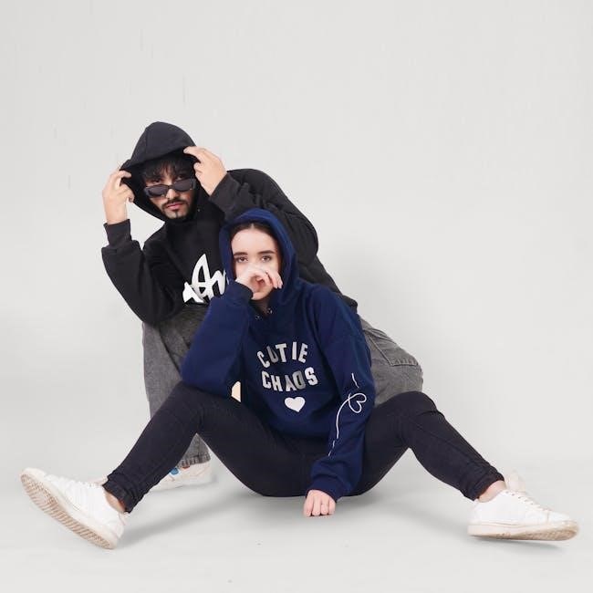
Chest logo placement is a classic and versatile choice, offering high visibility without being overly dominant. Typically, logos are positioned on the left chest, aligning with the heart, though right-side placement is also viable.
Embroidery provides a premium, textured look, ideal for smaller, detailed designs, while printing is cost-effective for larger, more colorful graphics. Vertical placement is generally around 5.58 inches down from the shoulder seam for men’s hoodies, slightly higher—about an inch—for women’s styles.
Consider the hoodie’s fabric; darker fabrics benefit from contrasting thread or print colors for optimal legibility. Ensure the logo size complements the chest area without appearing too large or cramped, maintaining a balanced aesthetic.
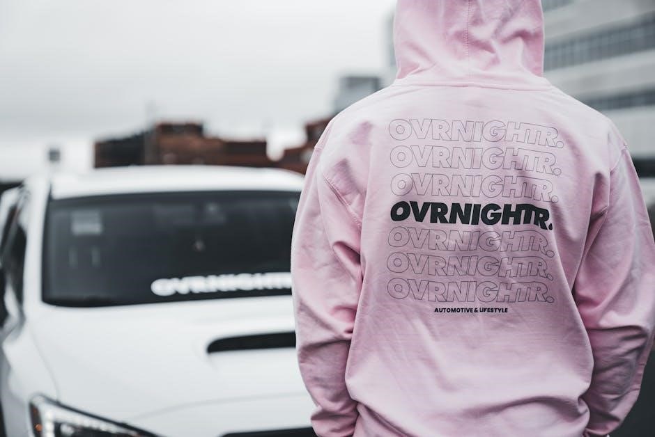
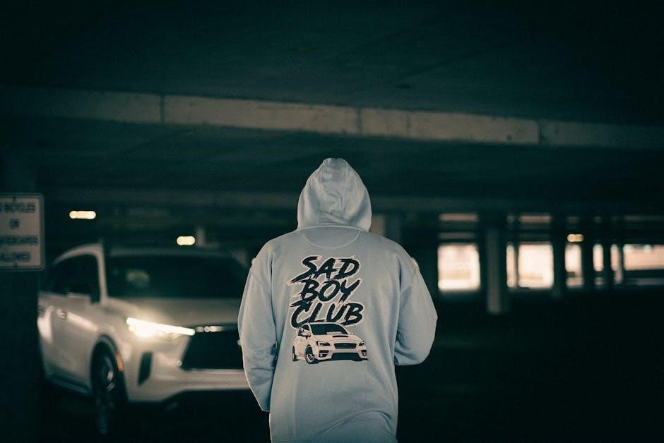
Back Logo Placement ‒ Upper Back
Upper back logo placement offers a larger canvas for branding, creating a bold statement. Position the logo just below the hood, centered horizontally for a balanced look. This area is ideal for larger designs or impactful graphics, providing excellent visibility when the wearer is in motion.
Consider the size of the logo relative to the back panel; avoid designs that appear too small or overwhelm the garment. Ensure sufficient space between the logo and the hoodline to prevent distortion or obstruction.
This placement works well for brand names, slogans, or detailed artwork. Color contrast is crucial for readability against the hoodie’s fabric, ensuring the logo stands out effectively.
Sleeve Logo Placement ‒ Upper Arm
Sleeve logo placement, specifically on the upper arm, presents a subtle yet effective branding opportunity. This location is ideal for smaller logos or repeating patterns, adding a touch of sophistication without being overly dominant. Consider the arm’s natural movement; logos should remain legible during activity.
Placement typically occurs on the upper arm, avoiding the bicep flex point to prevent distortion. Ensure consistent logo orientation across both sleeves for a balanced aesthetic. This area is well-suited for brand identifiers or secondary logos complementing a chest or back design.
Pay attention to sleeve color; contrast is key for visibility.
Hoodie Logo Placement ‒ Left vs. Right
Choosing between left or right side logo placement on a hoodie is largely a stylistic decision, though subtle conventions exist. Traditionally, the left chest is favored, mirroring the placement of a heart – subconsciously associating the brand with personal connection.
However, right-side placement offers a unique, less common aesthetic, potentially making the logo stand out. Consider your target audience and brand identity; a bolder brand might benefit from the unconventional right-side approach.
Consistency is crucial. If designing a range, maintain uniform placement across all hoodies. Ensure the logo size and orientation complement the garment’s overall design.
Logo Sizing Guidelines
Optimal logo sizing is crucial for visual impact; balance brand visibility with aesthetic harmony, considering hoodie size and design complexity for best results.
Optimal Logo Width for Adult Hoodies
Determining the ideal logo width for adult hoodies requires careful consideration of several factors to ensure a balanced and visually appealing design. Industry best practices frequently suggest a logo width of approximately 3.4 inches as a solid starting point. However, this isn’t a rigid rule, and adjustments are often necessary.
The overall aesthetic and the complexity of the logo itself play significant roles. A highly detailed logo might necessitate a slightly larger width to maintain clarity, while a simpler, minimalist design could effectively utilize a smaller size. It’s also vital to consider the hoodie’s overall size and cut; a larger hoodie can accommodate a proportionally larger logo without appearing overwhelming.
Ultimately, the goal is to achieve a harmonious balance between brand visibility and aesthetic appeal, ensuring the logo enhances the hoodie’s design rather than detracting from it.
Adjusting Logo Size for Women’s Hoodies
Women’s hoodies typically have a more fitted silhouette and often feature narrower shoulders compared to their male counterparts. Consequently, logo sizing requires adjustment to maintain visual balance and avoid an oversized appearance. Generally, positioning the logo approximately one inch higher than on men’s hoodies is recommended.
Reducing the logo width slightly – perhaps by 0.5 to 1 inch – can further refine the aesthetic. This ensures the logo complements the hoodie’s shape without appearing disproportionately large. Consider the target demographic and brand identity; a bolder logo might still work well, but careful evaluation is crucial.
Prioritize a cohesive look that enhances the hoodie’s overall design and flatters the wearer’s physique.
Considerations for Small Logos
Small logos offer a subtle branding approach, ideal for minimalist designs or when a sophisticated aesthetic is desired. However, placement is critical; ensure sufficient contrast with the hoodie fabric to maintain visibility. Strategic locations, like the upper chest or sleeve, work well.
Avoid areas prone to distortion during wear, such as directly over seams or folds. Consider repeating the small logo in a pattern for increased impact, or pairing it with a larger back design.
Prioritize high-quality embroidery or printing to ensure clarity and prevent the logo from appearing blurry or indistinct. A well-executed small logo can be incredibly effective.

Specific Placement Measurements
Precise measurements are key: 5.58 inches down from the left shoulder seam for vertical placement, ensuring centered horizontal alignment for optimal logo display.
Vertical Placement from Shoulder Seam
Determining the ideal vertical position for your hoodie logo begins with referencing the shoulder seam. Industry recommendations suggest a starting point of approximately 5.58 inches down from the left shoulder seam for adult-sized hoodies. This measurement provides a balanced and aesthetically pleasing look, avoiding placement too high or too low.
However, it’s crucial to adjust this measurement based on the hoodie’s size and gender. For women’s hoodies, a slightly higher placement – around 1 inch above the men’s standard – is often preferred, complementing the typically narrower shoulder structure. Accurate measurement and careful consideration of the garment’s fit are essential for achieving a professional and visually appealing logo application.
Horizontal Placement for Centering
Achieving horizontal centering of a logo on a hoodie requires careful consideration of the garment’s width and the logo’s dimensions. Begin by finding the horizontal center point of the chest area. Then, precisely position the logo so its center aligns with this midpoint, ensuring visual balance.
Avoid extending the logo too close to the armholes, as this can cause discomfort or distortion. Maintain adequate spacing on both sides to create a clean and polished appearance. For wider logos, slightly reducing the size may be necessary to prevent overcrowding. Accurate measurements and a keen eye for symmetry are vital for a professional finish.

Design Considerations for Logo Visibility
Maximize logo impact through strategic color contrast against the hoodie fabric, and ensure the logo style complements the placement for harmonious aesthetics.
Color Contrast and Hoodie Fabric
Achieving optimal logo visibility hinges on a strong contrast between the logo’s colors and the hoodie’s fabric. Dark logos generally pop on lighter-colored hoodies, while lighter logos stand out against darker backgrounds. However, consider the specific fabric texture.
For example, a matte logo on a shiny fabric can create a subtle, sophisticated look, whereas a glossy logo on a matte fabric will draw more attention. Avoid colors that blend too closely with the hoodie, as this diminishes the logo’s impact.
Test color combinations with fabric swatches before finalizing the design. Furthermore, think about the overall aesthetic – a bold contrast might suit a streetwear-inspired hoodie, while a more muted contrast could be better for a minimalist design.
Logo Style and Placement Harmony
The logo’s style should complement its chosen placement on the hoodie. A large, bold graphic logo suits the upper back or chest, creating a statement piece. Conversely, a minimalist or small logo works well on the sleeve or left chest, offering a subtle brand identifier.
Consider the hoodie’s overall design aesthetic. A vintage-inspired logo pairs nicely with a classic hoodie style, while a modern, geometric logo complements a contemporary cut. Ensure the logo’s shape and form align with the hoodie’s silhouette.
Avoid overcrowding the design; balance the logo’s presence with the hoodie’s existing features. A harmonious blend of style and placement enhances the overall visual appeal.
Advanced Logo Placement Techniques
Explore innovative techniques like mini logos, repeat patterns, pocket placements, and integrating logos onto hoodie drawstrings for unique branding statements.
Mini Logos and Repeat Patterns
Subtle branding can be incredibly effective, and mini logos offer a sophisticated alternative to large, prominent designs. These smaller iterations of your primary logo can be strategically placed across a hoodie – think along the sleeves, near the hem, or even scattered across the hood itself.
Repeat patterns, utilizing a simplified version of your logo or a related graphic, create a textured, all-over print. This technique works particularly well for creating a more dynamic and visually interesting garment. Consider the scale of the repeat; a smaller, tighter pattern feels more refined, while a larger scale makes a bolder statement. Experiment with different color combinations to ensure the pattern complements the hoodie’s base color and doesn’t overwhelm the overall design. This approach is ideal for brands aiming for a contemporary and fashion-forward aesthetic.
Placement on Hoodie Pockets
Hoodie pockets present a unique and often overlooked branding opportunity. Embroidered or printed logos on the chest pocket, or even on kangaroo pockets, offer a subtle yet visible placement. This location is particularly effective as it’s within the wearer’s natural line of sight and easily noticed by others.
Consider pocket style when determining logo size and placement. A smaller, minimalist logo works best on smaller pockets, while larger pockets can accommodate more detailed designs. Ensure the logo doesn’t interfere with the pocket’s functionality. Placement should be balanced and symmetrical, enhancing the overall aesthetic. This technique is ideal for brands seeking a functional and understated branding approach, adding a touch of sophistication without being overly ostentatious.
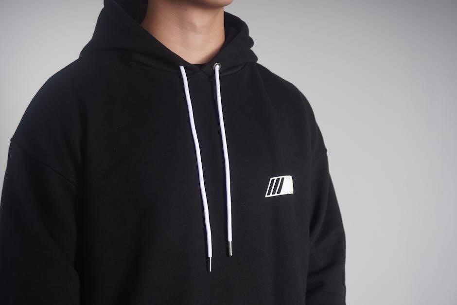
Hoodie Drawstring Logo Integration
Integrating logos onto hoodie drawstrings offers a distinctive and subtle branding element. This technique involves printing or weaving the logo directly onto the drawstring material, creating a repeating pattern or a single, prominent display. It’s a clever way to add brand recognition without dominating the hoodie’s overall design.
Consider drawstring material and logo complexity. Simpler logos work best for weaving, while printing allows for more intricate designs. Ensure the logo doesn’t compromise the drawstring’s functionality or durability. This placement is particularly effective for brands aiming for a modern, understated aesthetic, providing a unique touch that sets their hoodies apart. It’s a subtle yet impactful branding opportunity.

Industry Best Practices
Avoid common mistakes like overly large logos or poor color contrast; Current trends favor minimalist designs and strategic placements for optimal brand visibility.
Common Mistakes to Avoid
Overly large logos can overwhelm the hoodie’s design, appearing garish and detracting from overall aesthetics. Conversely, logos that are too small may lack visibility and fail to effectively communicate the brand message. Poor color contrast between the logo and hoodie fabric is another frequent error; ensure sufficient distinction for readability.
Incorrect centering or asymmetrical placement can create an unbalanced look, diminishing the professional appeal. Ignoring the hoodie’s seams and natural contours leads to awkward logo positioning. Failing to consider the wearer’s movement—how the logo appears during activity—is a crucial oversight. Finally, neglecting to test logo placement on various hoodie sizes and colors can result in inconsistencies and a subpar final product.
Trends in Hoodie Logo Design
Minimalist logos are gaining traction, favoring clean lines and subtle branding for a sophisticated aesthetic. Vintage and retro-inspired designs evoke nostalgia and offer a unique, textured look. Placement of mini logos in repeat patterns, or strategically on pockets, is becoming increasingly popular, offering a modern twist.
Experimentation with embroidery, particularly for chest logos, adds a premium feel and tactile quality. Bold, oversized logos remain relevant, especially for streetwear-focused brands, making a strong statement. Integrating logos into the hoodie’s drawstring provides a subtle yet distinctive detail. Finally, asymmetrical logo placement is emerging as a trend, offering a contemporary and unconventional look.
Tools and Resources for Logo Placement
Mockup generators and design software facilitate visualization, while professional embroidery/printing services ensure quality execution of your hoodie logo designs.
Mockup Generators and Design Software
Utilizing mockup generators is crucial for visualizing logo placement before production, saving time and resources. These tools allow designers to digitally apply logos to hoodie templates, experimenting with size, color, and position. Popular options include Placeit, Smartmockups, and Canva, offering user-friendly interfaces and diverse hoodie styles.
Design software like Adobe Photoshop and Illustrator provides greater control over logo creation and placement. Designers can create custom mockups, manipulate graphics, and ensure precise alignment. Vector-based designs are ideal for scalability without losing quality during embroidery or printing. Consider utilizing design assets and templates to streamline the process and maintain consistency across branding materials.
Professional Embroidery/Printing Services
Partnering with experienced professionals ensures high-quality logo application. Embroidery offers a premium, durable finish, ideal for intricate designs and a textured look, while printing is cost-effective for complex graphics and larger quantities. Reputable services provide expert advice on thread types, ink choices, and fabric compatibility.
Discussing technical specifications with the service provider is vital. Share vector files of your logo and precise placement measurements. They can advise on logo size limitations based on the chosen method and fabric. Request samples to assess the final product before bulk production, verifying color accuracy and overall quality.

Testing and Refinement
Sample production and feedback are crucial for verifying logo placement, size, and overall aesthetic before committing to a large-scale run; iterate based on results.
Sample Production and Feedback
Creating physical samples is a vital step in the hoodie logo placement process. Before bulk production, order a small batch of hoodies with the proposed logo placements and sizes. This allows for a tangible assessment of the design’s visual impact and wearability.
Gather feedback from a diverse group representing your target audience. Ask for opinions on logo visibility, size proportionality, and overall aesthetic appeal. Consider factors like color contrast against various hoodie fabrics.
Pay attention to practical considerations – does the logo feel comfortable against the skin? Does the placement distort during wear or washing? Use this feedback to refine your design and ensure a high-quality final product. Don’t skip this crucial step!
Iterative Design Process
Embrace a cyclical approach to hoodie logo placement. Initial designs are rarely perfect; anticipate revisions based on sample production and feedback. Treat the process as a series of refinements, constantly improving the logo’s position, size, and style.
Document each iteration, noting changes made and the rationale behind them. This creates a clear record of your design journey and helps avoid repeating mistakes. Experiment with multiple placements – chest, back, sleeve – to explore different aesthetic options.
Be open to unexpected discoveries. Sometimes, a slight adjustment can dramatically improve the overall look. A willingness to iterate leads to a more polished and impactful final design.